How Not to Write a Syllabus (and What to Do Instead)
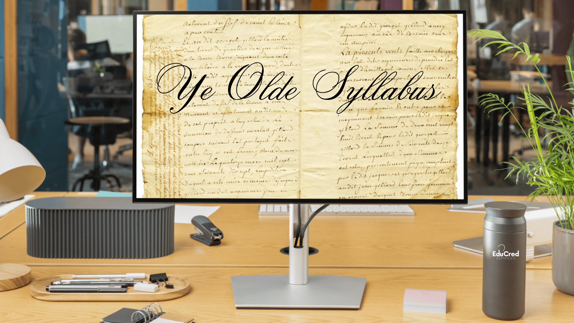
If you’ve ever had to refer to your car manual just to change your clock settings (hello, daylight savings time) and found yourself flipping through 150 tiny pages of information you don’t actually need in search of the 1 sentence that will help you, you already know what it feels like for a student trying to find something in a poorly constructed syllabus. If you just want to know when your assignment is due, you don’t want to scroll through a multi-page course description, three pages of institutional policies, and an outdated bio about the instructor’s dog. Is there a right way to construct one perfect syllabus to rule them all? Absolutely not. But there is definitely a wrong way, and today, we’re going to help you avoid it.
Who’s Your Audience? (Spoiler: It’s Not Your Chief Operating Officer)
The syllabus isn’t your annual report. It’s not a compliance memo. And it’s definitely not a legal deposition written in passive voice. It’s a guide for your students (actual human beings), many of whom are trying to make sense of a new class, a new semester, and, in some cases, a whole new life direction. So, write like you're talking to them. Nobody likes reading a document that sounds like it’s mad at them. If the first thing students see is “Late work will NOT be tolerated under ANY circumstances,” you’ve already lost them. Students aren’t out to get you. Assume good intent. Communicate expectations with clarity, not capital letters.
Use plain, direct language that tells students exactly what they need to do and when. “You must submit assignments by Sunday at 11:59 p.m. (Eastern Time) on the Canvas LMS” is much more helpful than “Assignments should be submitted per the timeline outlined in the digital interface.”
Structure matters, too. Use clear visual hierarchy, headings, bullet points, bolded deadlines, even color coding. If students have to squint at a wall of text to find out when their first quiz is, your syllabus is working against them.
What Not to Do
Imagine that you’re an adult learner returning to college for the first time in 15 years. You’re nervous that you’re out of practice and that everyone else will be smarter, faster, and better than you. You log in to the course environment for your first class and open up the syllabus. Under the course title, you see:
"Assignments shall be submitted via the portal as outlined in the digital learning management interface, pursuant to course expectations. Late work is NEVER accepted and constitutes an immediate F.”
This is confusing, vague, overly formal, references another document, and opens with a threat. The tone creates distance between the instructor and the student, when what you really want is clarity and respect. Students shouldn’t need a translator (or a call with their therapist) to understand your policies.
What This Could Say
“All weekly assignments are due by Sunday at 11:59 p.m. (GMT). Because deadlines help keep everyone on track, late work isn’t accepted. However, if you experience an emergency or anticipate a conflict, please reach out to me at (email address) before the deadline, and we can discuss options.”
This version is still firm but fair. It sets a clear boundary, explains the why behind the rule, and invites communication before a problem arises. We’ve moved from “Here are my punishments” to “Here’s how we stay on track together.”
Make It Searchable, Downloadable, and Mobile Friendly
If your syllabus file name includes the word “scan,” you’re already in dangerous territory.
Students need to be able to access your syllabus from wherever they are—on their laptop at the airport, on their phone during their lunch break, or on their home computer three minutes before class starts. That means your syllabus should be searchable, downloadable, and mobile-friendly.
This means sticking to digital file types that support text selection, search functions, and screen reader compatibility. That way, students can use Ctrl+F (or Command+F, we see you, Mac friends!) to jump straight to “grading policy” or “due dates” without scrolling through 12 pages.
Focus on using clear, consistent formatting. Headings should actually look like headings. Don’t switch between five fonts and three different bullet styles just because you can. Your syllabus isn’t a ransom note. Consistent formatting is just good design and good accessibility. It helps screen readers interpret structure correctly and helps all readers find what they need faster.
What Not to Do
Nobody wants a scanned, sideways PDF image file that blurs when students try to zoom in on their phones. It’s unsearchable, inaccessible, and practically unreadable. It makes students feel like an afterthought and signals that you haven’t updated your materials in years.
What This Could Be
A clean, text-based document or HTML file that opens smoothly on any device. Headings are clear and consistent. Students can use ctrl+F to jump straight to the grading policy or late work expectations. They can download, highlight, and add their own notes. Screen readers can parse the structure correctly.
Sequence Like It Matters (Because It Does)
Your syllabus isn’t a mystery novel. There should not be a “big reveal” several pages in.
Students open your syllabus looking for key information: How do I pass this class? What’s due and when? How do I contact the instructor if something goes wrong? If they have to scroll past a three-page course description, a personal mission statement, and a full-page plagiarism policy just to find your office hours, they’re going to feel lost (and probably frustrated).
Start with the essentials first. This includes the course schedule, due dates, grading breakdown, and how to get help. Regulatory boilerplate, policy language, and anything that applies universally to every course at your institution can appear later or be linked (think Catalog) in a consistent, standardized section.
Syllabi are more effective when they’re structured in the order students need to use them. Think of it like the “frequently asked questions” section, organized from most frequently asked to least.
What Not to Do
Don’t start the syllabus with:
Institutional Policies
ADA, FERPA, and three pages outlining what happens if a student plagiarizes.
Academic Honesty Policy
Students must sign and return this before accessing the course modules.
Course Description
“This course explores the evolving nature of epistemological frameworks in post-industrial knowledge economies.”
This structure prioritizes what’s required by your institution, not what’s needed by your students. Don’t bury key details beneath generic content, legal disclaimers, and dense jargon. This leaves students guessing about what matters most to them.
What This Should Be
The syllabus immediately answers the questions students are most likely to have in the first week (and throughout the course):
Basic course schedule
Instructor contact info, office hours, and communication expectations
Whether the course has scheduled synchronous, labs, or practicum meeting times, and when they occur
Where to find assignments and how to submit them
What’s due and when
How grades are calculated
What to do if something goes wrong
Institutional policies, course descriptions, and legal disclosures can and should still be included, but should be grouped at the end in a clearly labeled section like “Institutional Policies and Resources,” with hyperlinks for quick reference.
This layout makes it easy for students to get their bearings on day one and become familiar with how to easily find the information they need.
Provide Tools, Not Just Rules
Of course, students need to know what’s expected, but they also need to know how to meet those expectations. Instead of focusing solely on what students can’t do, make space to show them what they can do and how. If participation is graded, tell them what good participation looks like. If a project is worth 40% of the final grade, link to the rubric or provide examples of strong past work.
A syllabus that lists rules but omits support resources hurts both your students and your institution. You want them to use the library, the tutoring center, and all the other services your team has spent time and money developing. Help yourself help them! Make those resources visible and accessible.
What Not to Do
A syllabus includes three major research-based assignments worth 60% of the final grade, with requirements for peer-reviewed sources and proper citation formats. But there’s no mention of:
How to access the library.
Where to find credible sources.
Links to citation tools.
Contact information for a librarian.
Where students can go if they’ve never written a research paper before.
This structure assumes students will just “figure it out,” even if they’ve never used your library system, never learned how to vet sources, and aren’t sure where to start. You’ve assigned a destination without giving them a map (or even telling them there is a map).
What This Should Do
Don’t just list the assignment and walk away; connect your students to actual support. Include information and links to the library (info about specific databases, how to contact the librarian), and reassure students they’re not expected to already know how to do everything. Use your syllabus to provide guidance instead of waiting for students to ask for it (or miss the mark entirely).
A syllabus should be a tool for success. When it’s clear, accessible, and helpful, it saves time, reduces confusion, and sets the tone for the entire course. So, take a second look. If your syllabus sounds aggressive, makes students scroll for hours, or forgets to mention the resources you’ve worked hard to build, it’s time for a reset.